City of Calgary 311 App Redesign
Elevating the digital experience of Calgary's 311 system
Role
UX/UI Designer
Industry
Civic Design
Duration
4 months

Here's how I did it!
RESEARCH
HEURISTIC EVALUATION
The app lacked clarity, feedback, and navigational support, creating confusion and frustration for users

DESK RESEARCH
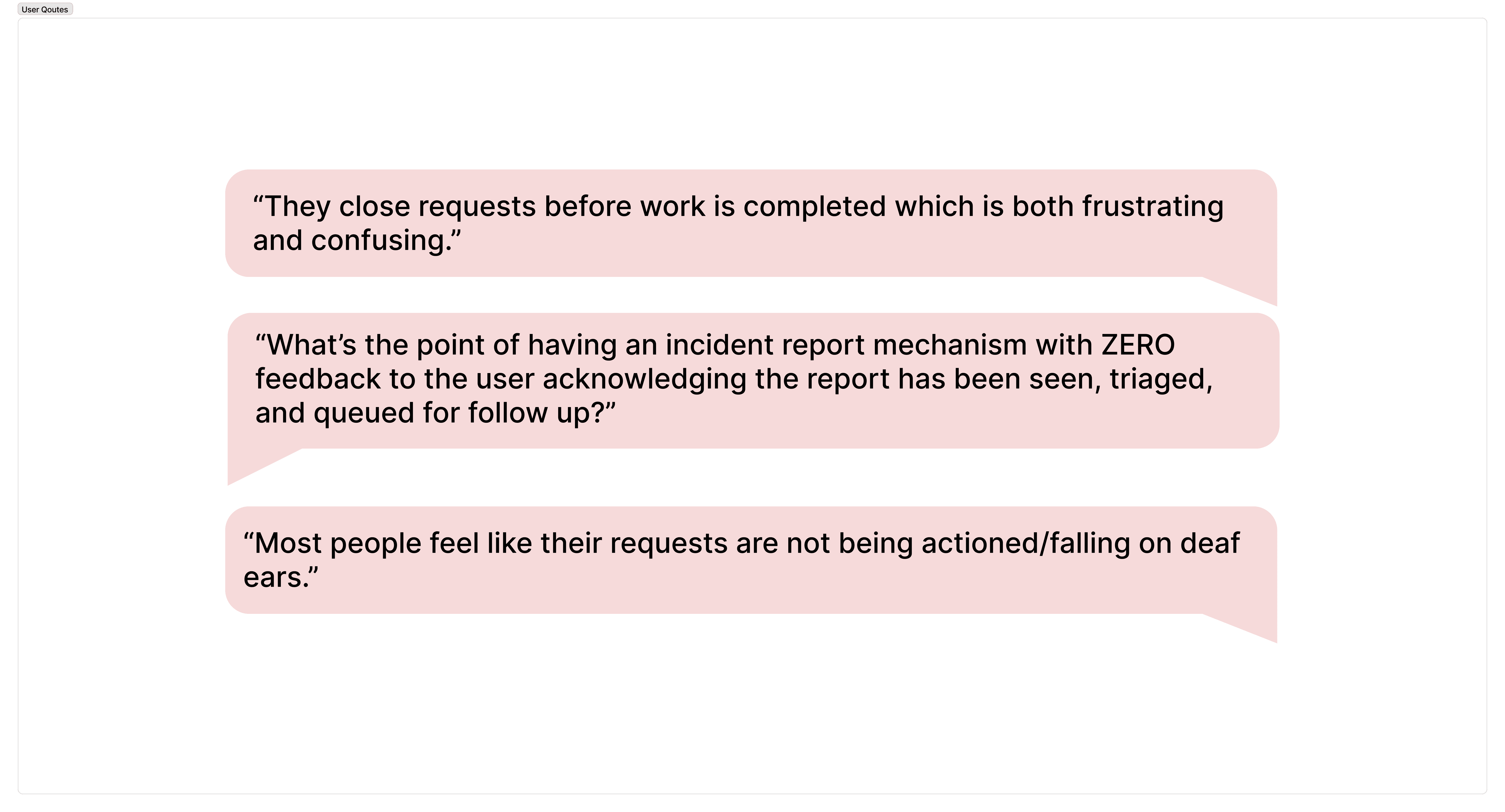
I also researched content available online, like reviews and Reddit threads of people’s lived experiences with the app. Below are some of the comments:
USER JOURNEY
When the system says ‘closed’ but reality shows otherwise, cognitive dissonance breaks user trust


USER TESTING
Users value clarity, guidance and transparency

Key Takeaways:
Users preferred a step-by-step submission flow over one long form, as it felt less overwhelming.
Dropdown categories made navigation clearer and easier than infinite scrolling.
Participants wanted a stronger visual hierarchy for readability and clarity.
Clearer messaging on privacy and anonymity was essential for trust.
More exit points were needed to prevent users from feeling trapped in the process
.
WIREFRAMES
From this…

To this!

Design Validation
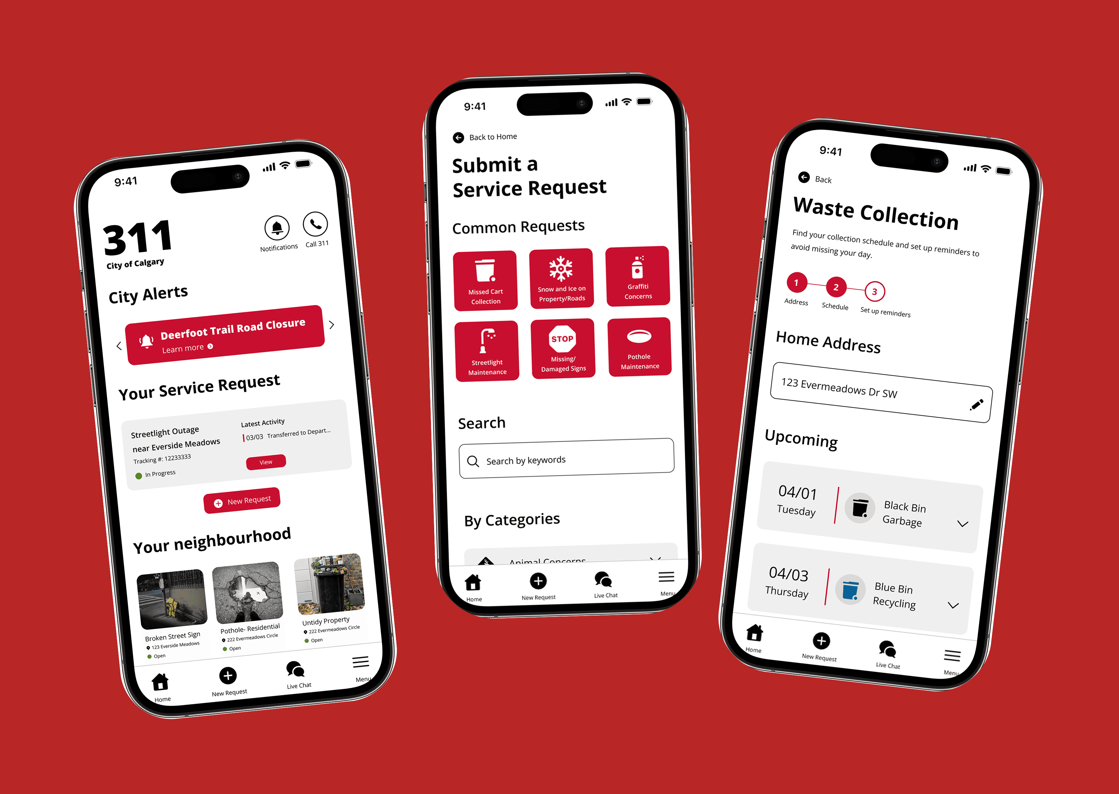
Large Buttons: According to Fitts’ Law, “Touch targets need to be large enough for users to accurately select them." This benefits older individuals who are older and are not as tech savvy, as this gives them a better margin of error.
Common Requests: The current version of the app has the categories all laid out, but this can lead to cognitive overload. To alleviate this, I have taken the 6 most submitted requests and created a common request at the top, which will reduce the need for individuals who need these requests to go through all categories, making the submission process faster and easier.
Goal Gradient Effect: I also implemented a linear system of request submission. We know this to be effective from the user test, but the goal gradient effect suggests that users feel more motivated to complete tasks if they are able to see the progress they are making. This also keeps users in the flow and reassures them when important actions or parts of the submission process are completed, which prevents them from having to double-check, which further reduces cognitive load.
Peak End Rule: The Peak End rule states that the most important experiences for the user are the beginning and the end, and the best way to end the submission process is to reassure them and confirm that their request has been submitted. This reduces the need for second-guessing.
Privacy & Anonymity: To alleviate concerns of anonymity, there is a clear message that lets users know that the contact information of their request will remain anonymous to the public, but the option to share their request (except for their contact info) with the public is also available.
Areas for Improvement
Capacity for multilingual support.
Integration with other City services.
Integration of a 311 Knowledge base.
Reorganization of categories and subcategories to reduce redundancy.


Other projects
Inglewood Community Branding
Creating a brand identity for Calgary's oldest neighborhood
Datejar: Mobile App Case Study
A mobile app that helps couples and friends plan fun, creative, and stress-free dates.
Data Visualization Project
Creating a visual story through data driven design

Material Data: Visualizing Information
Does the fear of death hinder or motivate people's life?