Data Visualization Project
Creating a visual story through data driven design
Role
Information Designer
Industry
Data Visualization
Duration
1 month
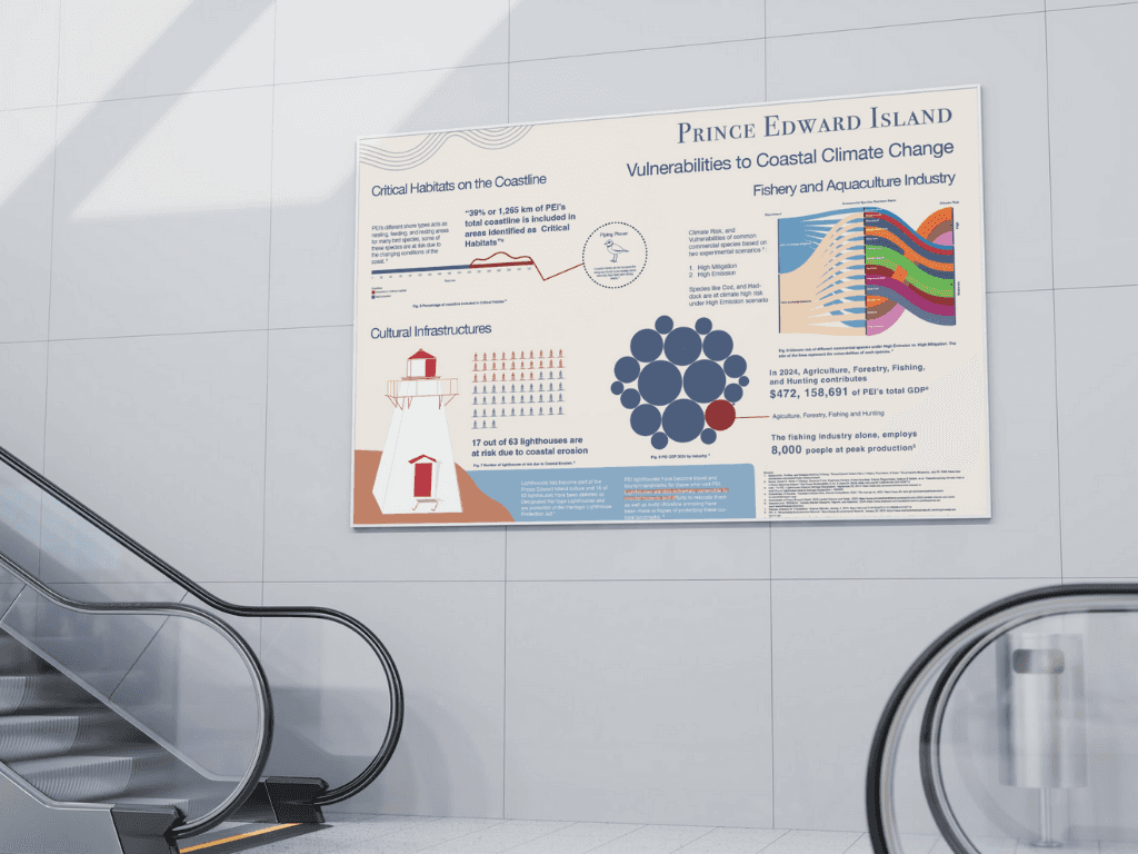
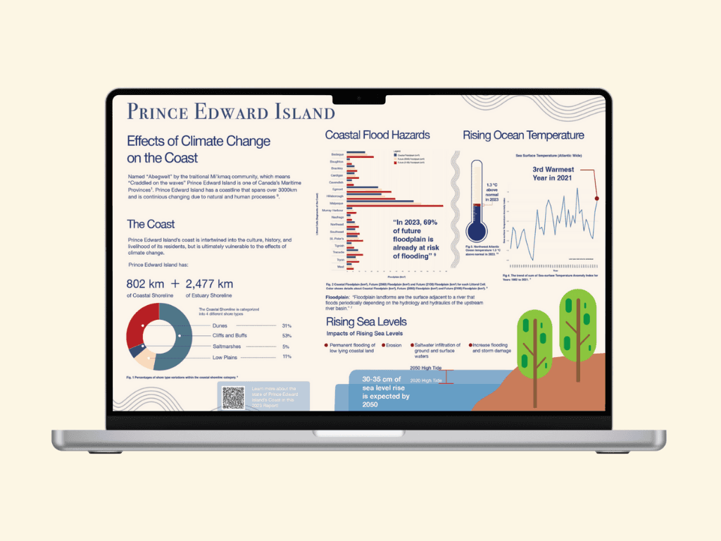
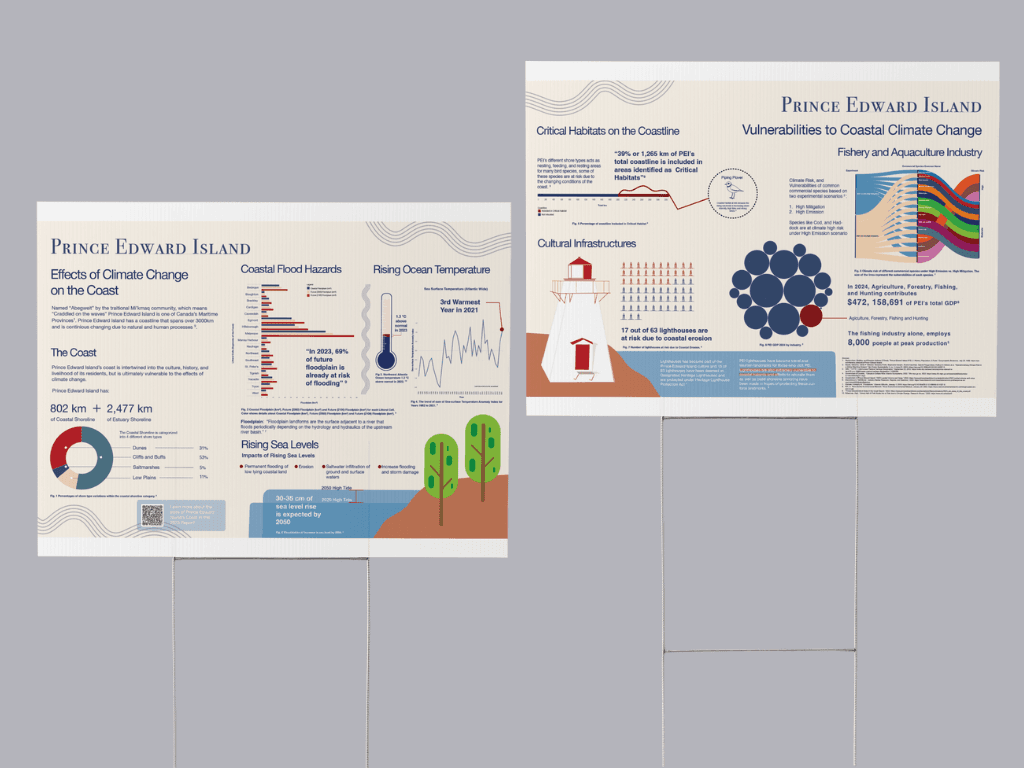
Key Visualizations
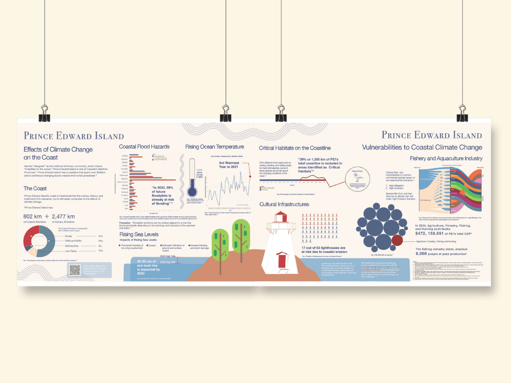
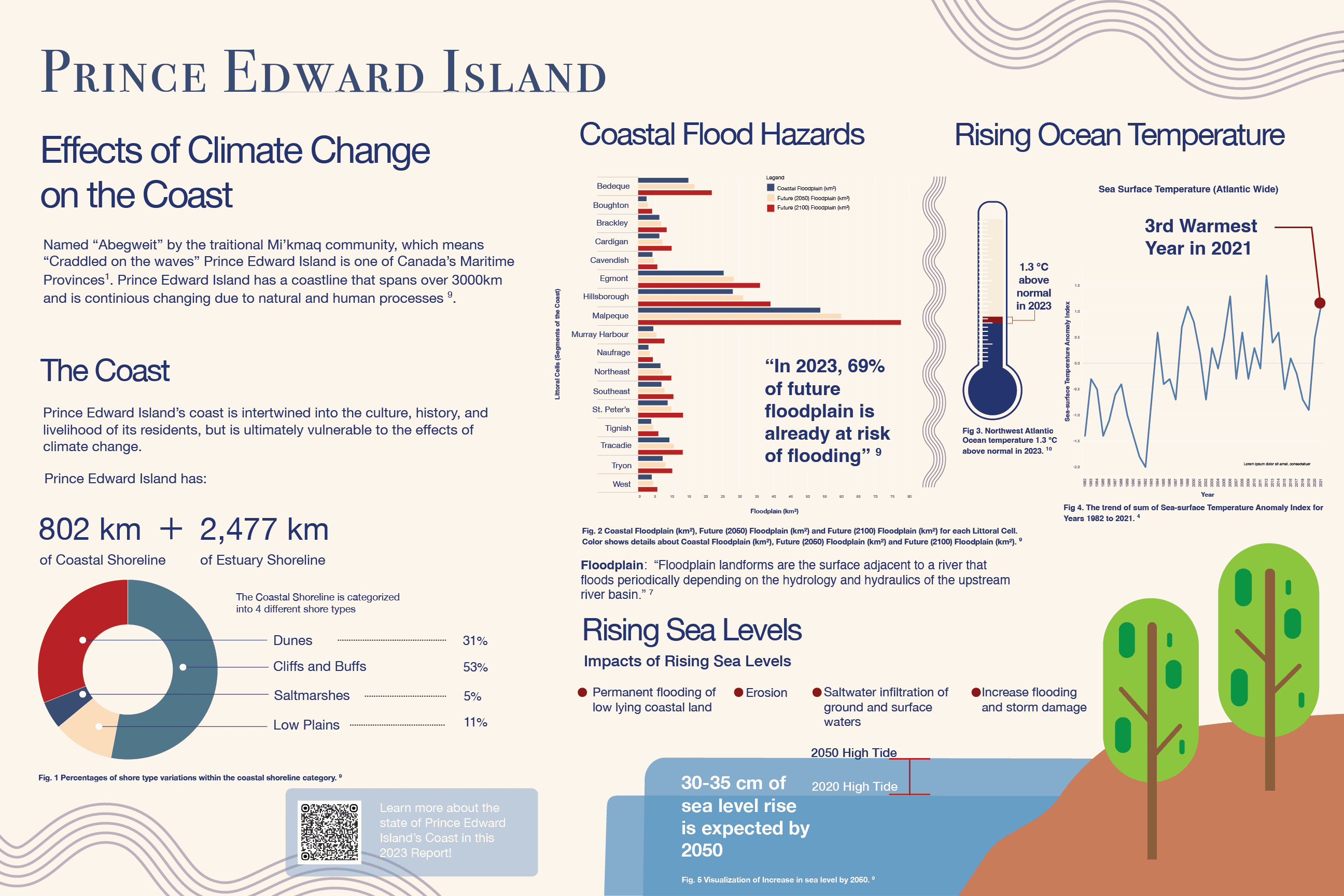
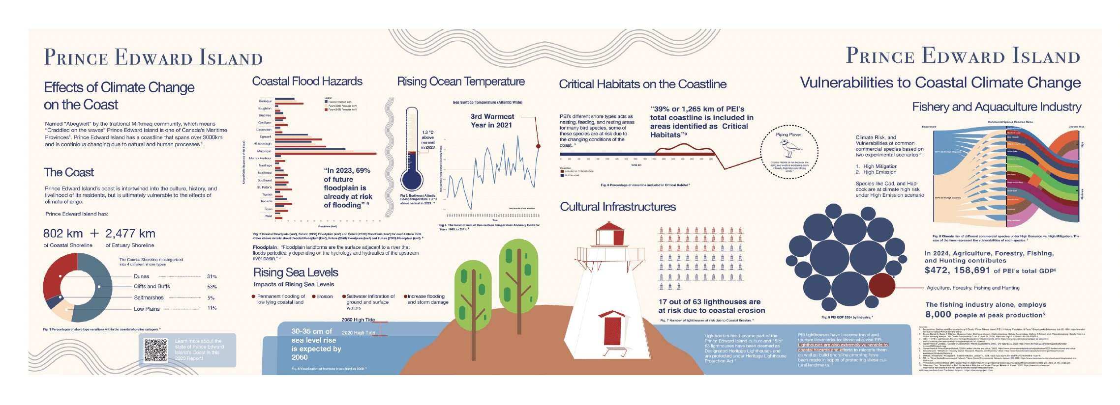
Coastal floodplain projections for 2050 and 2100
Rising ocean surface temperature trends (1982–2021)
Sea level rise impacts on high tides by 2050
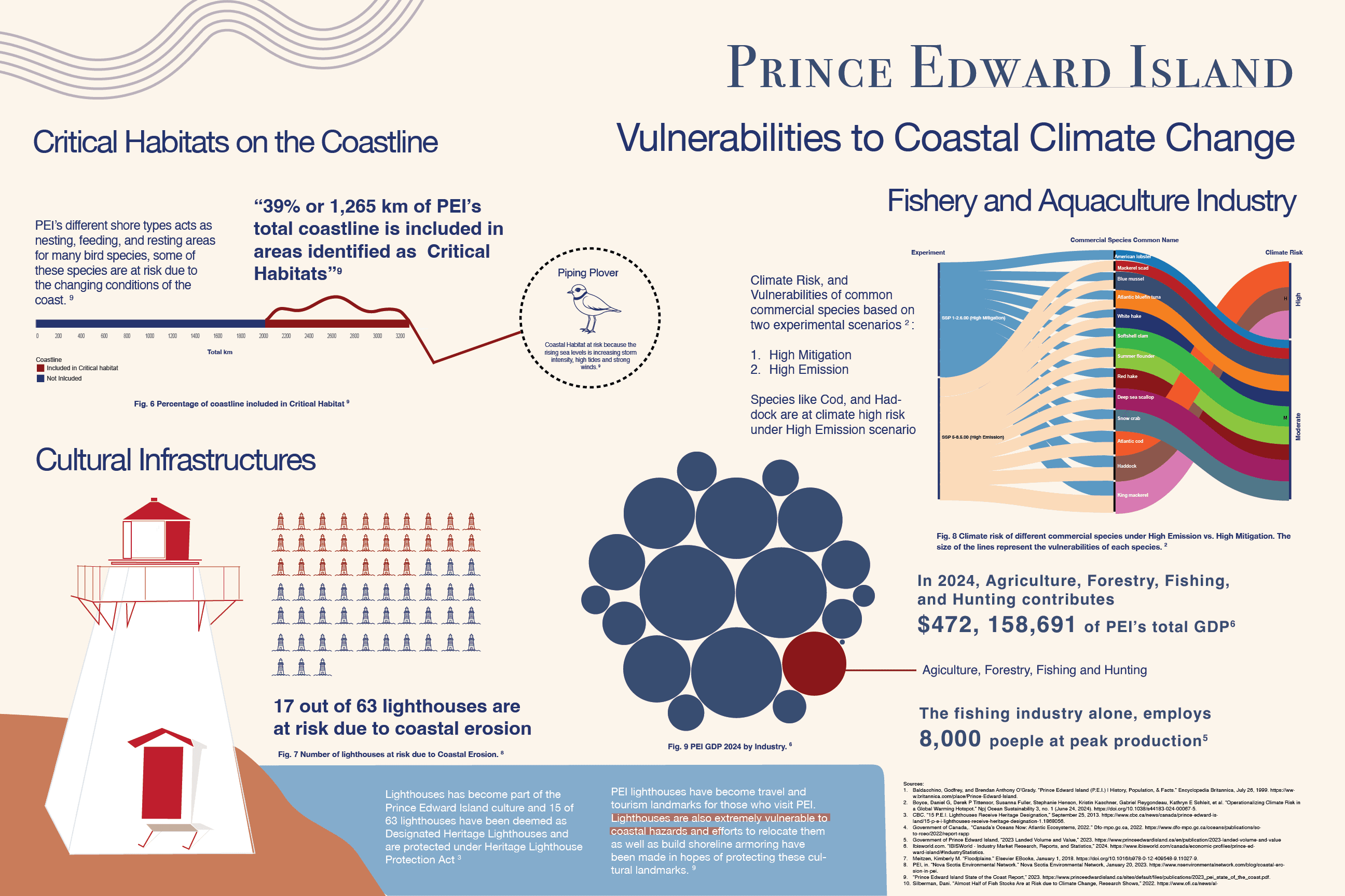
Vulnerabilities of PEI’s lighthouses and cultural sites
Fisheries and aquaculture at climate risk under different emission scenarios
Outcomes
This project strengthened my skills in:
Visual storytelling: translating complex climate data into accessible narratives.
Systemic design: ensuring cohesion across multiple large-format posters.
Original visualization & illustration: creating all visual elements from scratch to ensure consistency and clarity.
Balancing ethos and pathos: combining credible data with emotional visual elements.
Ultimately, the posters aim to inspire awareness and protection — not only of Prince Edward Island’s coastline, but also of the cultural and ecological heritage that depends on it.
Other projects
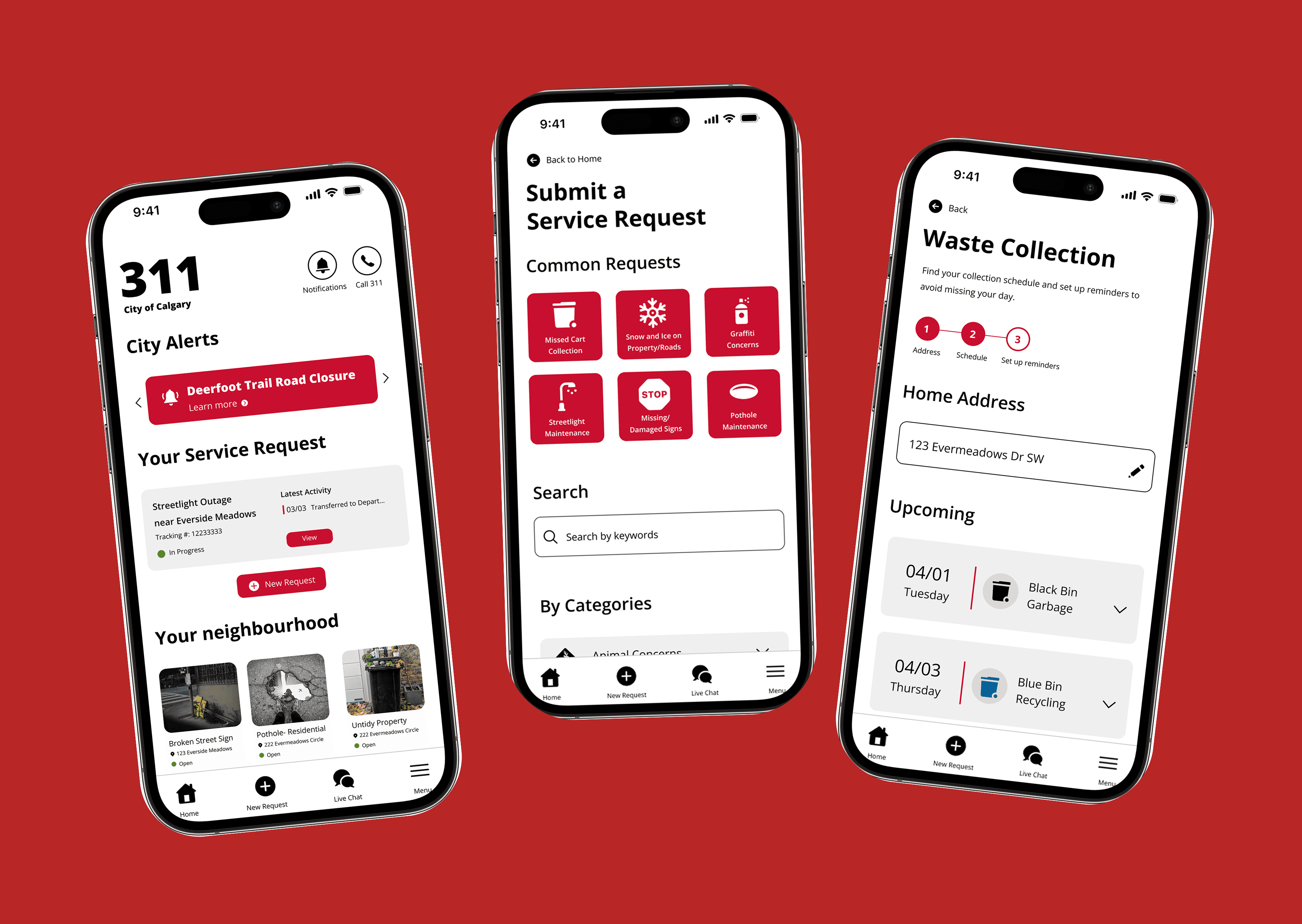
City of Calgary 311 App Redesign
Elevating the digital experience of Calgary's 311 system
Inglewood Community Branding
Creating a brand identity for Calgary's oldest neighborhood
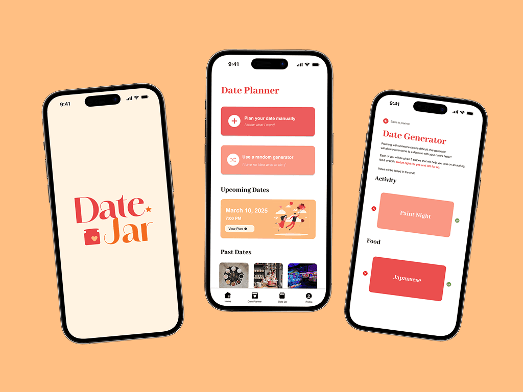
Datejar: Mobile App Case Study
A mobile app that helps couples and friends plan fun, creative, and stress-free dates.

Material Data: Visualizing Information
Does the fear of death hinder or motivate people's life?