Inglewood Community Branding
Creating a brand identity for Calgary's oldest neighborhood
Role
Brand Designer
Industry
Branding/ Visual Communications
Duration
2 months
Process
ETHNOGRAPHIC RESEARCH
We researched Inglewood’s history, demographics, arts and culture, social media presence, and literature. We were able to delve deep into Inglewood’s identity and also understand how community members and visitors to Inglewood view Inglewood.
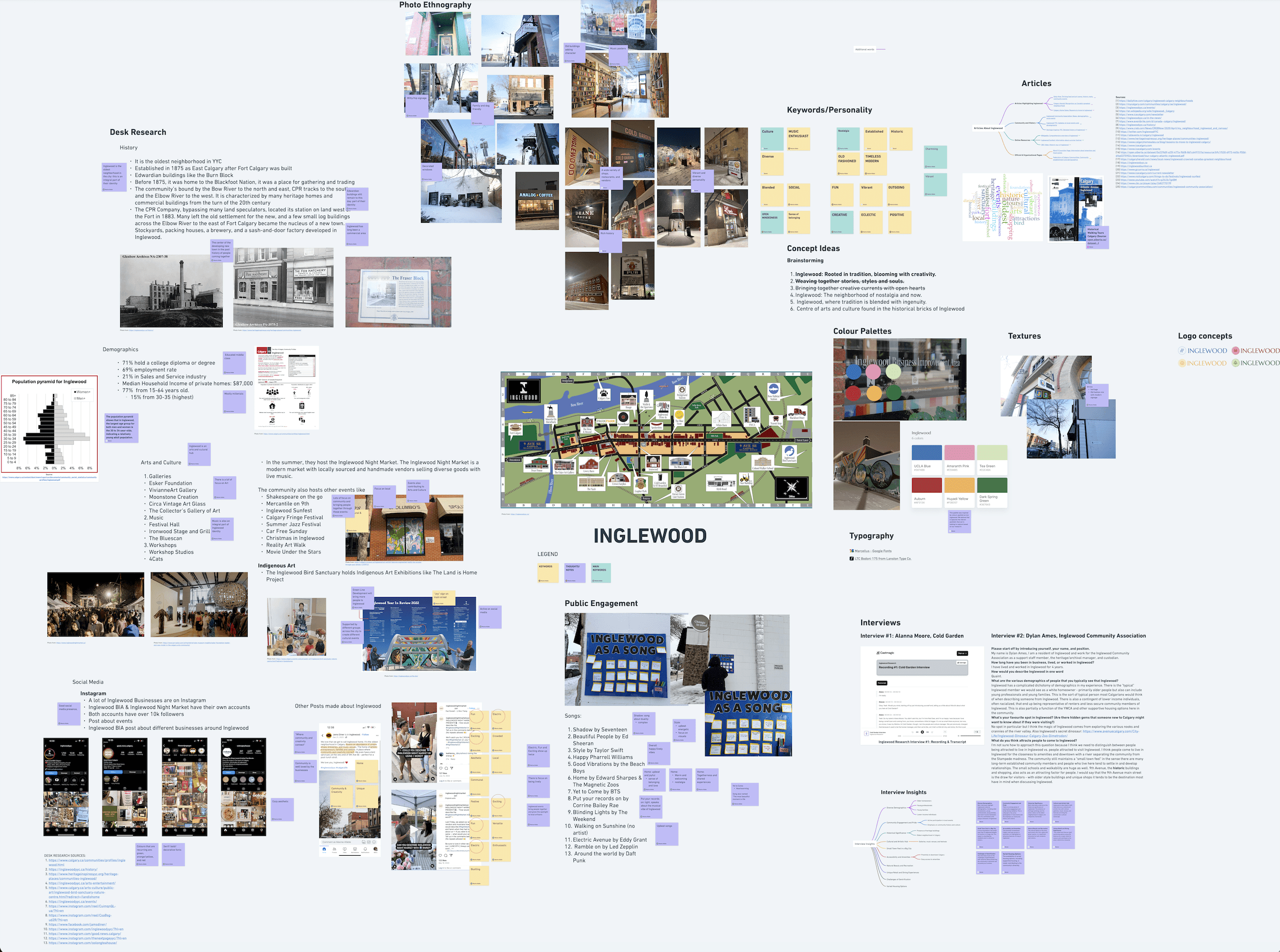
Research Activities that we did included:
Photo Ethnography
Desk Research
Examining Literature
Examining Social Media Presence
Public Engagement
Interviews
Here's a deeper look into some of the research we did!
PUBLIC ENGAGEMENT
Inglewood sounds like belonging, welcome and nostalgia
To conduct public engagement, we put up a poster that invited passersby on the main street to describe Inglewood as a song. This was insightful, as we could infer how people viewed Inglewood and describe it through music. We were left with responses that evoked a sense of belonging, welcome and nostalgia. Upbeat and lively music was also prominent.

INTERVIEW
History, art, and community define Inglewood’s identity
We were able to interview Alana Moore, a manager at Cold Garden restaurant, and Dylan Ames from the Inglewood Community Association. Both interviews were insightful there were similarities found in both interviews, as both interviews highlighted these three aspects of Inglewood’s Identity: historical significance, arts and cultural hub, and the importance of community.

PHOTO ETHNOGRAPHY
Every corner tells a story of history and creativity.
These visuals highlight Inglewood’s unique blend of heritage architecture and contemporary artistic expression.

LITERATURE REVIEW
A neighbourhood with a strong history!
Historical archives and local articles emphasize Inglewood’s industrial beginnings, strong community ties, and cultural significance. These sources contextualize the area’s transformation into a modern hub while maintaining its historic character.

DESIGN APPLICATION
A community newsletter…
Our community newsletter incorporates all our brand elements, such as our logo, colours, icons, and patterns, to maintain a cohesive visual identity. It features articles about Inglewood's art and history, a local business spotlight, a map highlighting notable areas, and a collection of upcoming events to encourage community engagement. The recommended events align with our brand's concept statement and cover music, art, comedy, and environmentalism, all of which are integral to our brand identity.
View the Downloadable PDF here

THE RATIONAL
Concept Aspect | Design Component | Representation |
|---|---|---|
Traditional | Typefaces | The typeface that we chose for the logo and the subheading is a serif font that is rooted in classical typography. The fonts that we chose appear to be more traditional and formal, which mirrors the long-standing history of Inglewood, as the oldest neighbourhood in Calgary. |
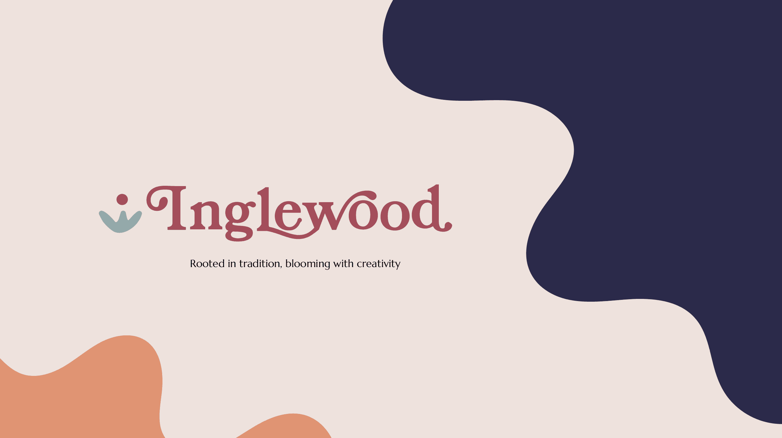
Creativity | Logo | The logo that we created uses swatches that extrude from the typeface itself, which symbolizes the blooming of creativity that is prominent in Inglewood. Inglewood is an art and cultural hub that nurtures creativity and where artistry grows, which is also symbolized through the plant icon in our logo |
Open-minded | Icons & Patterns | Inglewood is a blend of different businesses and cultural and environmental spaces, where everyone peacefully cohabits as a community. Inglewood is open and welcoming to all, and this is symbolized by using our plant icon. The plant icon is blooming and unfolding, which represents Inglewood’s openness as a community. 2 of our patterns use the same element in different colours, which represents the blending of different aspects of Inglewood's identity. |
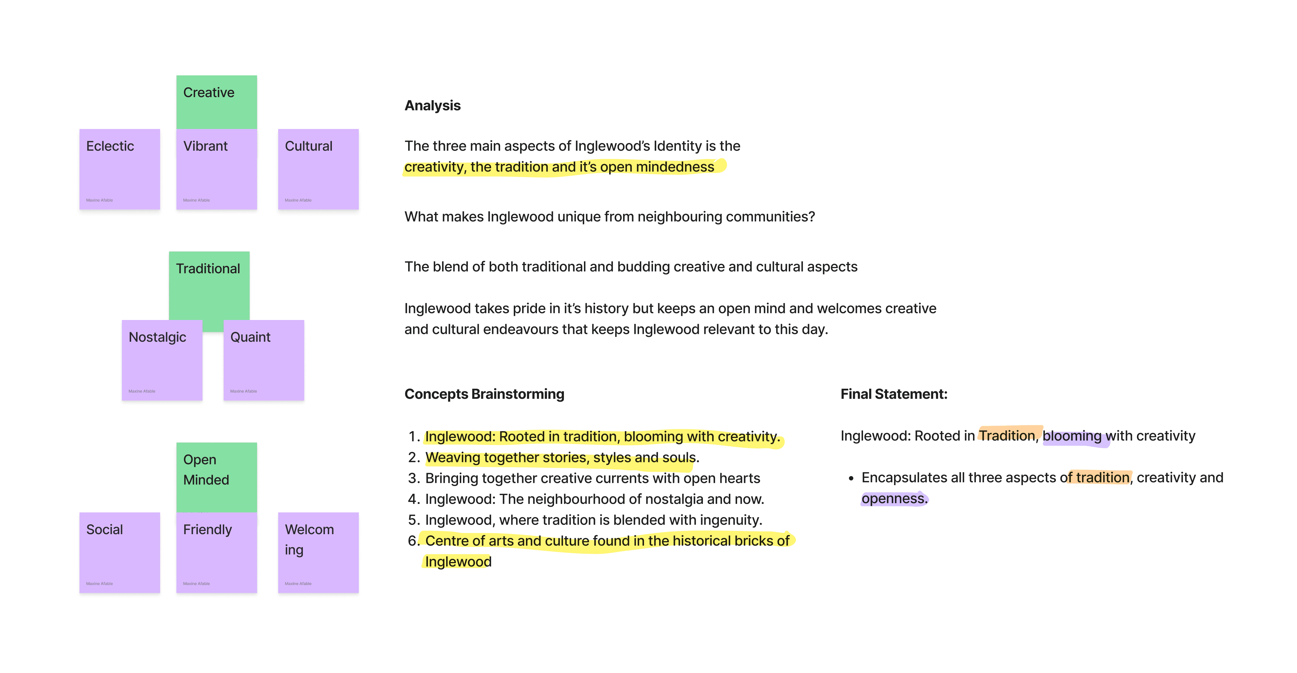
Vibrant/Eclectic | Colours & Patterns | Our color palette is bold and eclectic which includes a mix of warm and cool tones. It pairs earthy tones with vibrant colors to represent the eclectic and diverse nature of Inglewood |
Other projects
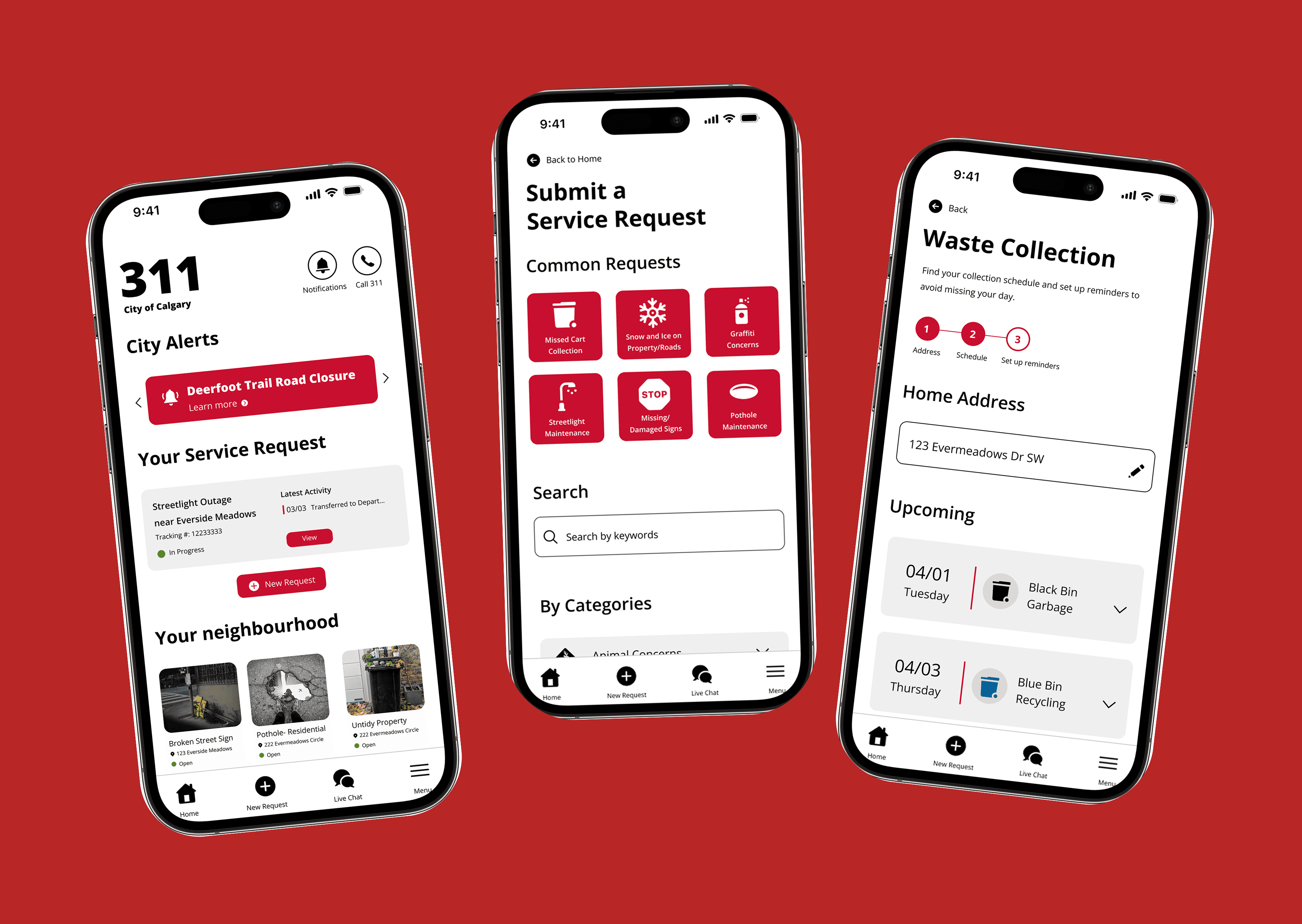
City of Calgary 311 App Redesign
Elevating the digital experience of Calgary's 311 system
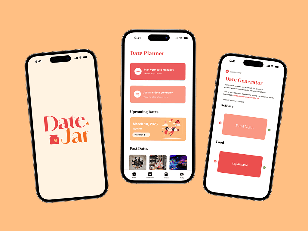
Datejar: Mobile App Case Study
A mobile app that helps couples and friends plan fun, creative, and stress-free dates.
Data Visualization Project
Creating a visual story through data driven design
Material Data: Visualizing Information
Does the fear of death hinder or motivate people's life?
